
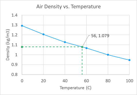
If you have a scatter plot and you want to highlight the position of a particular data point on the x- and y-axes, you can accomplish this in two different ways. As an example, I’ll use the air temperature and density data that I used to demonstrate linear interpolation. In the scatter chart below, the blue line represents the available data points. The intermediate green point on the line was interpolated from the available data.
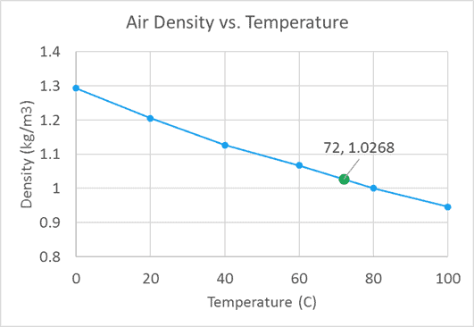
It would be nice to know where that data point falls on the x- and y-axes, so let’s look at one of the ways to do that:
Plot XY Coordinates in Excel by Creating a New Series
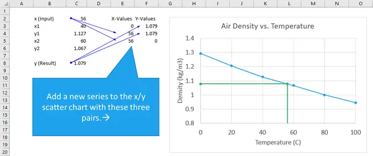
The lines extending from the x- and y-axes to the interpolated point (x-value, y-value) can be created with a new data series containing three pairs of xy data.

Elevate Your Engineering With Excel
Advance in Excel with engineering-focused training that equips you with the skills to streamline projects and accelerate your career.
Those pairs are as follows:
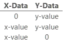
The first and second pair of data points comprise the horizontal line from the y-axis to (x-value, y-value) and the second and third points make up the vertical line extending upward from the x-axis.
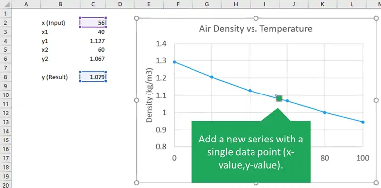
So if we start with the data from our table of air density and temperature, then add a second series with those pairs of data (using a scatter plot with straight lines and markers), we get the following:
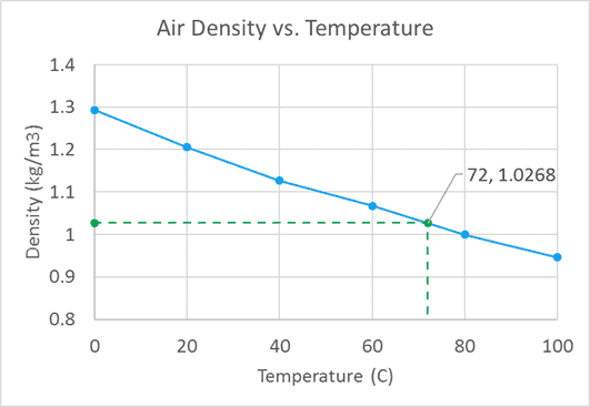
Then we can add a data label and change the horizontal and vertical lines to dashed lines for better readability:
Of course, since it’s a chart series it automatically updates. So if the desired x-value is updated, the horizontal and vertical markers update as well.
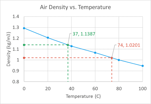
We could also use this method for multiple x/y pairs also:
Plot Coordinates in Excel Using Error Bars
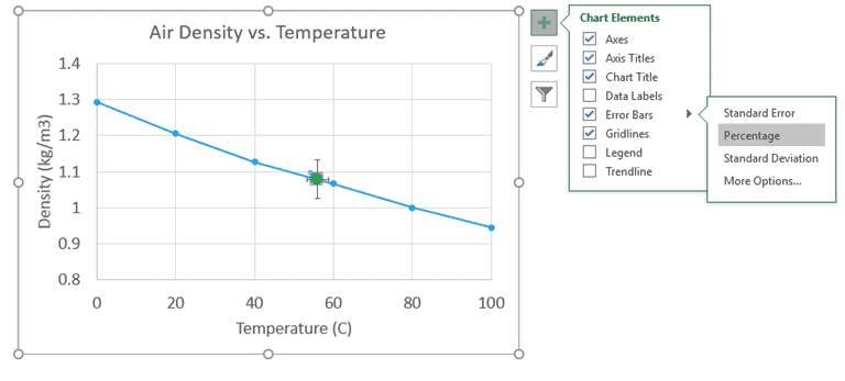
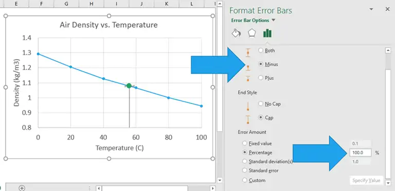
I’ve used the above method for a long time, but the next method was recently introduced to me by Jon Peltier of PeltierTech.com. Instead of using a series to create the horizontal and vertical lines on the scatter chart, his method is to use error bars.
It still starts by adding a second series to the chart. But this time only select the individual x- and y-values to create a series with a single data point.
Next, we can add percent error bars to this single-point data series. To add error bars in Excel 2013/2016, with the data series selected, click the green plus sign to the right of the chart, select the box next to “Error Bars” and choose the percentage type.
Next, right-click on either the x- or y- error bar and choose “Format Error Bar”.
Change the direction to “Minus” and the percentage to 100.
Repeat the same for the error bar in the other direction to get the following chart:
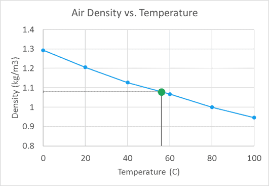
Of course, you can also add a data label to this data point and change the color and/or style of the error bars.