
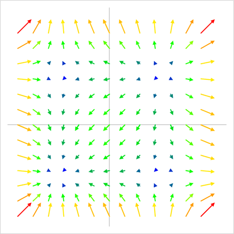
In the last blog post, I showed how to use VBA to create a vector plot in Excel. That plot was just a simple black and white vector plot. So in this post I’ll show you how to take that chart to the next level with a color scale to indicate the magnitude of the vectors, like the one below:
The basic concept for creating the colored vector plot was this:
- Define a gradient which will be used to color the vectors.
- Determine the magnitude of each of the vectors
- Find the minimum and maximum magnitudes
- Calculate the relative percent magnitude of each vector (minimum = 0%, maximum = 100%)
- Interpolate on the gradient to find the percentage of red, green, and blue for the vector
- Plot the vector on the chart
- Apply the formatting to the vector, including the color
As you probably guessed, all of these steps (except for 1) were carried out in VBA. I’ll go through each one below
Defining the Gradient

Elevate Your Engineering With Excel
Advance in Excel with engineering-focused training that equips you with the skills to streamline projects and accelerate your career.
Excel makes it easy to play with gradients and find the one you like. I just created a rectangle on the worksheet, then filled it with a custom gradient with stops at 0%(red), 33% (yellow), 66% (green), and 100% (blue).
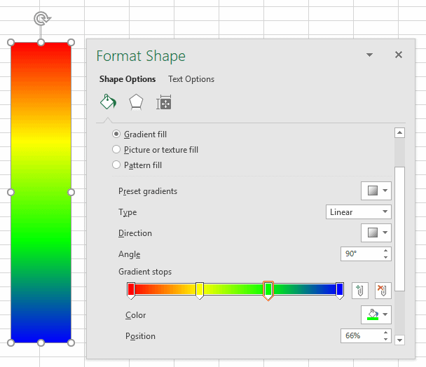
Next, I converted that into a table of RGB values vs. percent. I wanted 0% (or the smallest values) to be blue, and 100% (or the largest values) to be red. RGB values are integers between 0 and 255.
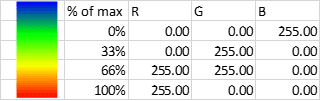
Later, I interpolated in VBA based on the relative magnitude of the vector (from 0-100%), so I also named each column (“legendx”, “legendr”, “legendg”, “legendb”) to make that interpolation easier.
With the gradient defined, let’s get into the VBA:
Calculating Vector Magnitudes, Minimum, Maximum in VBA
After defining the total number of vectors (numvect) and initializing the variables, “minvmag” and “maxvmag”, the code below loops through the rows of data to calculate each vector’s magnitude, “vmag”. It also stores each of the magnitudes in an array. This array will be used later when we color the vector with the appropriate color based on the gradient we defined.
Finally, the current value of vmag is compared to both maxvmag and minvmag. If it’s greater than maxvmag, the value of maxvmag is updated. If it’s less than minvmag, the value of minvmag is updated.
numvect = 196

minvmag = 1000000

maxvmag = 0

ReDim vmagarray(1 To numvect)

For j = 1 To numvect

x1 = Cells(4 + j, 2)

x2 = Cells(4 + j, 3)

y1 = Cells(4 + j, 5)

y2 = Cells(4 + j, 6)

vmag = Sqr((x1 - x2) ^ 2 + (y1 - y2) ^ 2)

vmagarray(j) = vmag

If vmag > maxvmag Then

maxvmag = vmag

ElseIf vmag < minvmag Then

minvmag = vmag

End If

Next j
Calculate the Relative Percent Magnitude of Each Vector
With the magnitudes of each vector as well as the minimum and maximum defined, I could move on to plotting each vector with a For loop (For i = 1 to numvect). Within the loop I had to normalize the vectors between 0 and 1, so that I could apply the gradient defined above. The equation below takes care of that:
relvmag = (vmagarray(i) - minvmag) / (maxvmag - minvmag)Interpolating to Get the Color for Each Vector
The relative vector magnitude could be any value between 0 and 1, so I needed to interpolate from the table above to find the correct color to apply to the vector. I used a simple linear interpolation function (LinInterp) I created previously to handle this.
And because RGB values are integers, I had to round the interpolation result to get the final value.
red = Round(LinInterp(relvmag, Range("legendx"), Range("legendr")))

grn = Round(LinInterp(relvmag, Range("legendx"), Range("legendg")))

blu = Round(LinInterp(relvmag, Range("legendx"), Range("legendb")))
Plotting the Vector
The VBA to plot the vector as a series and format it as an arrow is the same as before:
xvalues = "=Sheet1!$B$" & i + 4 & ":$C$" & i + 4

yvalues = "=Sheet1!$E$" & i + 4 & ":$F$" & i + 4

'add the series to the chart

ActiveChart.SeriesCollection.NewSeries

ActiveChart.FullSeriesCollection(i).xvalues = xvalues

ActiveChart.FullSeriesCollection(i).Values = yvalues

With Selection.Format.Line

.EndArrowheadLength = msoArrowheadLengthMedium

.EndArrowheadWidth = msoArrowheadWidthMedium

.EndArrowheadStyle = msoArrowheadTriangle
Applying a Color to the Vector
Finally, I used the interpolated RGB values (variables “red”, “grn”, “blu”) in the With loop to color the vectors:
.ForeColor.RGB = RGB(red, grn, blu)The Full VBA Subroutine for Creating a Colored Vector Plot
The entire subroutine for creating the colored vector plot in Excel is shown below:
Sub add_vector()

Dim xvalues As String

Dim yvalues As String

Dim numvect As Integer

Dim vmagarray() As Double

Dim minvmag As Double

Dim maxvmag As Double

Dim red As Integer

Dim grn As Integer

Dim blu As Integer

numvect = 196

'find the minimum and maximum vector magnitudes
'(these need to be defined before plotting)
'store the vector magnitudes in an array for later use

minvmag = 1000000

maxvmag = 0

ReDim vmagarray(1 To numvect)

For j = 1 To numvect

x1 = Cells(4 + j, 2)

x2 = Cells(4 + j, 3)

y1 = Cells(4 + j, 5)

y2 = Cells(4 + j, 6)

vmag = Sqr((x1 - x2) ^ 2 + (y1 - y2) ^ 2)

vmagarray(j) = vmag

If vmag > maxvmag Then

maxvmag = vmag

ElseIf vmag < minvmag Then

minvmag = vmag

End If

Next j

'activate the chart and select the plot area

ActiveSheet.ChartObjects("Chart 7").Activate

ActiveChart.PlotArea.Select

For i = 1 To numvect

'determine the relative percent magnitude of the vector
'(w.r.t. the minimum and maximum vectors)

relvmag = (vmagarray(i) - minvmag) / (maxvmag - minvmag)

'interpolate to find the % of red, green, and blue

red = Round(LinInterp(relvmag, Range("legendx"), Range("legendr")))

grn = Round(LinInterp(relvmag, Range("legendx"), Range("legendg")))

blu = Round(LinInterp(relvmag, Range("legendx"), Range("legendb")))

'define the xvalues and yvalues for the chart

xvalues = "=Sheet1!$B$" & i + 4 & ":$C$" & i + 4

yvalues = "=Sheet1!$E$" & i + 4 & ":$F$" & i + 4

'add the series to the chart

ActiveChart.SeriesCollection.NewSeries

ActiveChart.FullSeriesCollection(i).xvalues = xvalues

ActiveChart.FullSeriesCollection(i).Values = yvalues

ActiveChart.FullSeriesCollection(i).Select

'apply formatting to the series

With Selection.Format.Line

.EndArrowheadLength = msoArrowheadLengthMedium

.EndArrowheadWidth = msoArrowheadWidthMedium

.EndArrowheadStyle = msoArrowheadTriangle

.ForeColor.RGB = RGB(red, grn, blu)

End With

ActiveChart.ChartType = xlXYScatterLinesNoMarkers

Next i

End Sub
Conclusion
Creating a colored vector plot in Excel is a little complex, but it’s always fun to see how we can stretch Excel’s limits to do something new!