Engineers often create charts to visually communicate data. Excel is able to make a number of different types of charts, and there are a lot of customization options. First, we’ll look at XY scatter charts, which are probably the most common for engineers. Scatter charts are a very great way to display data. You can even use VBA to create a cool vector plot in Excel.
Before you create a scatter chart in Excel, it’s best to have the data organized so that the X data are in the left column, and the Y data are in the right column. Worksheet 02a has data that’s already organized this way. To quickly create a chart,
- Select the data, including the headers (the titles at the top of the columns). The fastest way to do this is to click the left column’s header, type Ctrl-Shift-Down Arrow, then Ctrl-Shift-Right Arrow.
- If you’ve already placed the Scatter Chart icon in your Quick Access Toolbar, you can click that to quickly make a chart. If not, go to the Insert tab, and locate the XY Scatter Chart button.
- We’d like to create a chart that’s easy to read without markers on each data point, so choose this one:
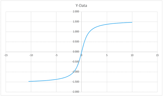
You can resize the chart by dragging the corner. The chart will look like this by default:
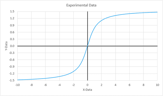
We’ll make several modifications to improve this chart. By default, the upper and lower limits of the axes are set to exceed the input data by a certain amount, so the data doesn’t fill the chart area. We can adjust these values so there’s less unused space. To do so, right-click on the x-axis, and select Format Axis. This will open up the Format Axis task pane:
In the Format Axis task pane, we can change the Minimum Bound of the x-axis to -10 and the Maximum Bound to +10. With the task pane already open, simply click on the y-axis to change its bounds – a minimum of -1.5 and a maximum of +1.5 will result in a chart that tightly fits the data, eliminating unused space.

Elevate Your Engineering With Excel
Advance in Excel with engineering-focused training that equips you with the skills to streamline projects and accelerate your career.
You can also increase the resolution of the axes, so that the labels occur at smaller intervals. To do so, change the Major Unit (just below the bounds in the task pane) to 0.3. This will increase the number of labels on the y-axis.
The labels on the axes contain the same number of decimal places as the input data by default. This gives us unnecessary zeroes on the y-axis labels. To remove these, scroll down in the Format Axis task pane and click Number. Enter the number of decimal places you’d like (1 decimal place works well here).
The labels of the axes go through the middle of our data, so the data will be easier to read if we move those. To do so, select Labels in the Format Axis task pane (just above Numbers). Change the Label Position to Low. This will move the y-axis to the left-hand side of the chart. Click on the x-axis and change its Label Position to Low as well in order to move it to the bottom of the chart.
With the labels on the outside of the chart, the x- and y- axes are difficult to distinguish; it’s hard to tell where zero is on the chart. You can change the formatting of the axes to make them stand out. If you’re still within the Format Axis task pane, simply click the paint bucket icon just below Axis Options:
Click Line to see all the options to format the line of the axis. It will be easier to see if we change the color to black and the line width to 1.5:
You can repeat this process for the other axis.
For documentation, it’s important to have appropriate chart and axis titles. By default, Excel creates a chart title from the header of the Y column if you have only one column of Y data. Select the title, then double-click on the text. Enter in a more appropriate title (i.e. “Experimental Data”).
To add axis titles, click anywhere in the chart area, then click the green plus sign next to the upper right corner. Click the checkbox beside Axis Titles:
Double-click each axis title to rename it.
The last modification we’ll make is to increase the font size to make it more readable. Click somewhere inside the chart area, but outside the plot area. Then click the Increase Font Size button:
All of these changes result in a chart that conveys the necessary information and is easier to read. The finished chart should look like this: